Wednesday, November 7, 2018

Flat Plans


First Flat Plans


For the first flat plans, I have used my test shots to get a reasonable result as I know my drawing skills are not as good.
 I have used different features form fashion magazines to inspire me in creating my own front cover and contents pages.
but as we can see on my first try ... I didn't get the result I was expecting.


This plan was meant to be the November-2018 edition of Liberty(the title of the magazine I am creating)
I printed out the masthead and stuck it to the plan as I knew I will not be able to get close enough to the font desired, apart from the masthead I wrote and drew the rest of the plan.
I didn't want to copy the same features other magazines had so I made mine up but kept them realistic to the fashion industry standards.


The second edition (December-2018) plan of Liberty, came out more successful than the fist one as I already got the ideas and I knew the layout, whereas on the first one I was a bit sceptical with the colours and layout as well as the features.
Here we can see that I have glued on the masthead too much to the side thinking that this will be my final plan and I will change the first edition, but I felt like I had already too much on the cover.
I remembered most fashion magazines having simplistic covers so I went back to that on my final plans.


Here are the plans for the front covers...
I have been looking and trying to make everything bond and have a fluid continuity. 


However, I didn't consider the date and I just looked at the images and added the text for the contents thinning more about the layout rather than the general image and concepts cohesion.
On this contents page I took off the masthead as I wanted to try and design it myself from scratch. Once again it did not work. Therefore I left this without a masthead and I haven't colored it in.


I looked again at my mistakes and thought that this time I will not omit any small detail, so I started...
but looking at the final product I wasn't pleased with the layout and I realized I have tried to use different features and they were too many to fit in one page.
For this cover, I managed to color in and create the images that relate to the contents written.

I have been doing some corrections, as we can see the line under "cover stories", and the circled line followed by an arrow that suggests that it should be moved to a different place to improve my work.


Here we can see that I have improved my skills in planning and designing the contents page.


However, I changed my mind after seeing the final result.
I decided that the image would fit in the December edition best.
I also created a better Idea about what and how many sources of inspiration to follow in my work.


Once I have limited the options it became easier to plan and keep my mind clear while working and designing my front covers and contents pages.


Final Flat Plans

 This is my final flat Plan - Front Cover for the autumn edition(November-2018)


I decided to show the natural side of the model by having a close shot without makeup, just showing the models natural features... In the background, I was planning to have different color leaves to show the natures beauty and colorful derivations.

I decided to follow the simplistic convention of fashion magazines.
So, I made the features shorter but still attractive for the audience.

I used all the conventions of a fashion magazine including the social media platforms and barcode.

I used the social media platforms at the bottom but then I realised that I might not use them in Photo Shop as most Fashion Magazines don't use them.


 This is my final flat Plan -contents page for the autumn edition (November-2018)
Before starting on the contents page I planed the lay out and thought of how much I want to write and how my pictures will look like if I place them next to the text/contents.

Then I had in mind this photograph of a girl with her hair down, blonde hair, wearing a beautiful red garment running through the woods suggesting the desire to have freedom which also relates to the name of the magazine.
liberty
/ˈlɪbəti/
noun
  1. 1.
    the state of being free within society from oppressive restrictions imposed by authority on one's behaviour or political views.

 This will show a link to the photograph on the front cover as the model will be laying down on leafs-close shot...with no make up or clothes to be promoted. I have also included 2 other photographs that promote the contents.
The bottom picture will include different women/girls with different skin tones promoting ethnicity and equality.


This is my final flat Plan - Front Cover for the winter edition (December-2018)

Here I already knew what I want, looking back to the draft of the December edition.
I kept the simplistic template from the first edition, focusing more on the photograph rather then filling in the front cover with text.

This time, I was happy with the result and I managed to choose a photograph that focuses on the garment and its small details as well as the model since the main story is about the model.


Once again, I used the social media platforms at the bottom but then I realised that I might not use them in Photo Shop as most Fashion Magazines don't use them.


This is my final flat Plan -contents page for the winter edition (December-2018) 

I kept the image as I felt like the dress and the colours go well with the front cover and it shows a fluid continuity of colours and simplistic theme.
To show that there is a link between the first edition and second edition(the image ob the left) I kept the same features:
-On the cover
-Fashion
-Special Features
-Art and lifestyle
-Main photograph
- 2 other images linked to the list of contents.

I wanted a different layout for the contents page so for the second edition I chose to have the main image in the top centre, and the contents underneath whereas the first edition- contents page was starting with the contents straight from the top having an image on the top right side. I believe this shows continuity as they contain the same features even though the lay out is different.
Moreover, I think that the change in layout provides the viewers/consumers with diversity. Having diversity, people will not get bored and will continue looking for what is new as the magazine brings in the new trends and news in fashion.


Final Flat Plan for the Fashion Magazine Website

Similar to the Magazine Flat Plans, I used the printed mastehead, but I already has in mind a layout for the website, and it was so much easier to plan and think through what I want to do.
Here as well I took inspiration from different VOGUE websites. I applied a simplistic theme to the website as well as the magazine.
I only planed having the main page of the website, having social media on the left side the search bar on the top right side and the masthead and menu spread out in 4 sections:
-News
-Fashion
-Catwalk
-Art and lifestyle


If someone would click one NEWS this page would open up showing the latest articles.

The fist article is the main story on the physical copy of the magazine's December edition.


Once clicking on the first article, You can see the article opening up.
The article will have a similar image to the one on the front cover of the physical magazine, the image on the left side will be a slide gallery which will show a few photographs of the subject as well as the interview.


Tuesday, November 6, 2018

Location and Research - Test Shots - Model Consent Forms

I have decided the location for the test shots and probably final photographs for my cover, contents pages and website.
I looked at different magazines that are issued in November and December which I intend to use in my magazines due to the season and equipment available.
Therefore I want to have photographs taken outside emphasising the cohesion between nature and fashion for my front covers.

For the test shots I had in mind, I wanted to go to a park that allows me to take different perspectives of the colourful season of autumn, I researched a place that is closed to school as well as my house that will be convenient for the models as well as for the school so I could borrow the equipment needed.

LOCATION:  
Norbury Hall Park


I went to Norbury Hall park to see if the location is good.
Those are some of the pictures I have taken before the test shots.

I liked the fact that there were trees and natural light as well as a nice autumn vibe to it.


Test Shots

Firstly, I took photographs of Marie in the afternoon so that I could get the natural lighting at its best.She had different outfits but only two of them turned out to suit her well.
before going to the park we were at Solent Court - Norbury underground parking.

Marie
For this photograph I was looking at the dark side of autumn. That's why I used the half wet and dirty and the other half dry and closed... background-showing some sort of danger that go well with her black outfit that suggests danger with a mysterious touch from the red make up and hairstyle that covers her face.
Marie
For the other two I used the Park. I wanted the green-brown colours that represent the season, and also to show off the outfit and the colours the model is wearing.
Marie
 After taking Marie's photographs the natural light faded and it became dark,  I wanted to use the opportunity of having the equipment and the natural sunset lightning for Toni's photographs.

Toni

Toni
I realised that the darkness brings in a strange but interesting thought about the pictures to the viewer.

Toni
I liked the light of the of the sunset being reflected into the windows of the buildings seen in the background. the photograph also evidences the garments of the model and the pose of the model is exposing the good features of the clothing.

<<<<<<<<<<<<<<<<<<<<<<<<<<<<<<<<<<<<>>>>>>>>>>>>>>>>>>>>>>>>>>>>>>>>>>>>
Some shots of me taking pictures and also trying to show the model the poses I had in my vision.
<<<<<<<<<<<<<<<<<<<<<<<<<<<<<<<<<<<<>>>>>>>>>>>>>>>>>>>>>>>>>>>>>>>>>>>>


Model Consent Forms


Thursday, October 11, 2018

Website Investigation & Design

Fashion Magazine website investigation

USING WIX

I have used Wix before it was updated and seeing that they are offering such a diverse range of templates really helped me in choosing the right layout and format of a fashion magazine website.


I choose to go to the Fashion and beauty templates.

Most of the templates were aimed at beauty-makeup and fashion blogs or online fashion stores. 

I choose the template: Small Brand.

Then I looked at the template and I liked the way it was laid out so I clicked "Edit this site".
The tools available to change and personalize the site were very accessible. 


I have looked into the tools available and I tried to give my site a personal touch.


I looked at all the tools and used most of them just to get used to WIX, for when I will do my actual site for my fashion magazine. 

It took me 15-20 min to create the home page as you can see above. 
 I had to change the title and add social media links as well as change the content.

 The gallery at the top was a nice option, I saw many websites of fashion magazines having a slider gallery so I added one myself. I used the photographs available from WIX for this.

I went into a simpler version of my initial idea, I wanted to create a flexible slider to show the main picture of the articles that are part of the (TOP STORIES) but WIX did not have that option so I kept thing simple. 

Furthermore, the post in the middle is part of the top stories which was inspired from the Vogue website.  I had to delete the video that came with the template and replace it with a Versace Fashion show on YouTube. 

It was harder than I expected but it was a nice challenge. 


 ***However, this is the first time I am trying Wix since updated, and this is just an investigation. I will not use this as my final website.***


Case Studies of Fashion Magazines


fashion GIF by franknitty3000I went into further research about Vogue and made a simple case study inspired by Grazia's case study that is available on their website. For the case study, I had to look at different articles and use social media platforms to be able to give more information about Vogue magazine.


Monday, October 8, 2018

Celebrity/ Model Representation


Related imageWinnie Harlow 

aka Chantelle Winnie – she’s tall, slender, drop-dead gorgeous but there’s something that sets her apart – she has vitiligo.

Vitiligo is a condition that causes depigmentation in sections of the skin. It occurs when melanocytes (the cells responsible for skin pigmentation) die or are unable to function.

She’s the first model with the disease and her story is truly inspirational. She admits growing up was very tough and the bullying felt endless but she learned to love herself and is now a vitiligo spokesperson.

Winnie appeared on America’s Next Top Model in which she stated, “a lot of people have a story, a background, but mine is painted on my body”.

She’s taking the world by storm and inspiring others with her natural beauty and positive outlook on life.


Representation

We can see that Magazines are not afraid anymore of presenting models that aren't traditionally "PERFECT", in this case, perfect refers to white, tall, skinny models.

By having Winnie Harlow on the front covers of the magazines changes the traditional conventions of a magazine because she is not only representing black women but also those that have Vitiligo and those that don't fit with the traditional beauty standards.
1. GRAZIA

The image of the GRAZIA magazine is different from what they usually have, they use paparazzi photographs on most of their front covers.
However, this Photograph of Winnie Harlow is a studio shot, we can see the clear blue background which gives a simplistic theme to the front cover. The color scheme is very simplistic as well, the Cover lines and heading are white mainly, but we can see the use of black and red that we can find on the model as she wears red lipstick and the black hair that matches with the picture at the top and some of the text on the cover lines. The makeup used is very simple, aimed to highlight her facial features that have depigmentation.
The pose of the model, in this case, Winnie Harlow, is focusing on the facial features. We can only see her face and hands(close shot) suggesting that the issue is pointing out the beauty side that the magazine is promoting rather than fashion, moreover, at the bottom of the front cover, there are some beauty products which are promoted supporting the concept of beauty.


2. ELLE

ELLE is usually having mid-long shots of models/celebrities on their front covers.
Similarly to GRAZIA, the model is wearing her hear down, but this time the hairstyle is different as it straight.
The background is neutral- nude color, which matches the model's clothes especially her top, the black bra matches with the hair and the masthead of the magazine. The red trousers give a nice touch of color, the laces on the trousers match the color of the features of the magazine which are white.
The pose of the model shows a lot of the garment that is promoted as she poses standing.
We can clearly see that the model in this issue is promoting clothing/fashion rather than makeup and beauty.

3.BAZAAR

Similarly to ELLE, BAZAAR magazine uses celebrities and models on their front covers and promote fashion.
In this front cover, the model is posing in a red dress and a red hat that covers her hair but reveals her back as she is positioned sideways from the camera(over the shoulder pose). We can see her skin and the fact that she has Vitiligo and how she is not afraid to show her skin features to everyone.
her makeup is very bizarre and dark which matches with the features of the magazine adding a bit of mystery and giving it a dramatic effect, the masthead is white, less visible perhaps to focus the attention on the model rather than the title.
The background is grey-neutral, which makes the model and her garment stand out.


Colour Scheme, Feature & Typography Research

Feature Research


I have looked at different magazines and most of them have the features above.

I choose to present this magazine because it has the features I am interested in for my own magazines. 


TYPOGRAPHY Research 

Most popular fashion magazines use serif fonts like Bodoni or Didot as their standard font but today more and more magazines are started to use original, custom made fonts.


Vogue Magazine's logo has advanced in recent years, but its look remains firmly planted in font styles of the Didone. Beginning in 2015, the of Sans-Serif lettering has been used for the spread content and body as determined by Terminal Design Group for Vogue Magazine.

The font for Elle Magazine is Didot, Serif in nature, which compliments the polish of the Spread. The branding of the magazine is synonymous with the logo.
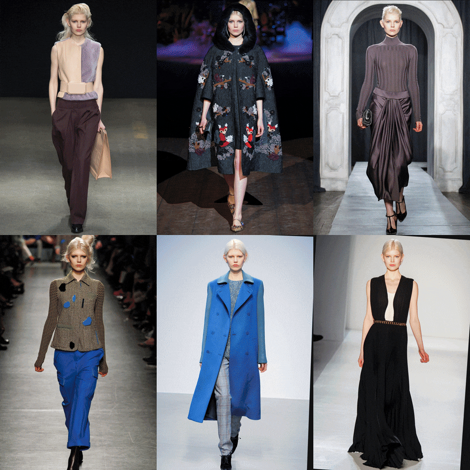
new york fashion GIF

I took inspiration from

 Elle and Vogue magazine.
I tried to use Vogue's font to have an idea of how it would look. I already know that I want my masthead to be in Capital letters.
Why? 
Because it makes a statement stands out and that can attract consumers.


1st Edition

Colour Scheme


2nd Edition 

Colour Scheme


Bauer Media Group Research

 Bauer Media UK is an entertainment network of iconic, multi-platform brands.

The business became part of the Bauer Media Group, Europe’s largest privately-owned media group, in 2008. Founded in Hamburg in 1875 and now in its fifth generation of family ownership, the Bauer Media Group operates in 20 countries including the UK, Germany, Poland, Australia, New Zealand, and the USA and has 11,000 employees worldwide.
Their brand riched 25 million consumers. With a portfolio that includes:
  • heat
  •  KISS
  • Grazia
  • Empire
  • Motor Cycle News
  • Parkers
  •  TV Choice
  •  Take a Break
  •  Bella
  • Magic & Absolute Radio.
"In an era where audiences are ever harder to categorize, we build strong cultural connections, drawing people together with the things that they really care about. Our brands become the lens through which our audiences see the world. "


CROSS-PLATFORM OFFER
  • Magazines 
  • digital 
  • radio 
  • television
  • advertising


When it comes to magazines, their heritage stretches back to 1953 with the launch of Angling Times.


More recently, Closer was launched in 2002 and Britain’s first weekly glossy, Grazia, was launched in 2005. 

Under the section "More from Bauer" I found Great Magazines, Greatmagazines launched in 2003 is the Bauer Media UK dedicated subscription sales website. Ranging over 71 Bauer Media UK magazines the site specializes in subscriptions and single-issue sales in both print and digital. The e-commerce site is not only mobile responsive but is fully optimized for international visitors with prices listed in 5 different currencies.


Management team


Fashion Photography& Fashion Magazine Photography Investigation


What is fashion Photography? 

A genre of photography devoted to displaying clothing or other fashion items. (It's not about the model as much as the garment that is worn by them)

The Light, color, location, narrative and pose are very important.
dressing fashion week GIF by Feliks Tomasz Konczakowski

Light

Backlighting adds a beautiful, flattering and fairytale quality to photographs. In this example, we can see that is done to emphasize the garment the model is wearing.  

Image result for dramatic fashion photography


Downlighting accentuates the mood of the photograph, they become very dramatic with obvious shadows and highlights.


Related image


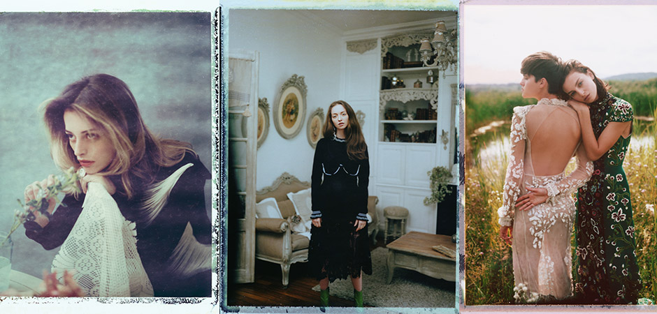
Natural light gives the true colors of the garment and its forms, it can give some of the best results.


Related image


Color is one of many strategies fashion photographers use to catch the eye of the consumers.


Image result for colourful fashion photography


Muted colors, can create a different vibe. It depends on the garment as well as the atmosphere the photographer is trying to create.


Image result for dramatic fashion photography


Black and white photography, is seen as traditional and "classy". In some cases black and white stand out from the other images in a fashion magazine.

Image result for dramatic fashion photography


Location

Fashion photography can be very flexible as it could be done in a Studio or even outside in the wider world where the photograph can present everyday situation and bizarre concepts. 


Narrative

 A photograph can show many things, it can express many concepts, actions, thoughts, emotions etc. 
Photographs that are used in the fashion industry usually tell a story depending on the garment, location, and theme.

Related image


Pose

The fashion photography industry not only promotes the garments but is trying to sell them, therefore models have to pose in different ways to make their outfits stand out and look impeccable. Here is an example of fast model posing showing how models have to pose to promote the garments they are wearing.   

 In some cases, Models have uncomfortable poses, but they need to show off the garment as best they can.
Image result for uncomfortable posesRelated image

Fashion Moodboard

1st Edition Mood Board

 The first edition of my magazine will have an autumn theme, focusing on natural colors.
The model will be posing in a natural environment that will help me highlight the theme.
Considering the A-B demographic which I aim to attract the model will be wearing formal- office like the outfit.
1st edition Mood Board - Inspiration


2nd Edition  Mood Board

On the second edition of my magazine, I will look at more cold colors, to emphasize the theme which will be linking with the winter season.
I am looking forward to a non- conformist look for my model as I want the consumers to have a different idea of the theme. People might think of winter as cozy and comfortable but I aim to get out the comfort zone and attract the public by having an eye-catching image of the winter trends.


2nd edition Mood Board - Inspiration

Statement of intent

How do you intend to use the four areas of the media theoretical framework to communicate meaning and meet the requirements of your c...